Bruce Goodman
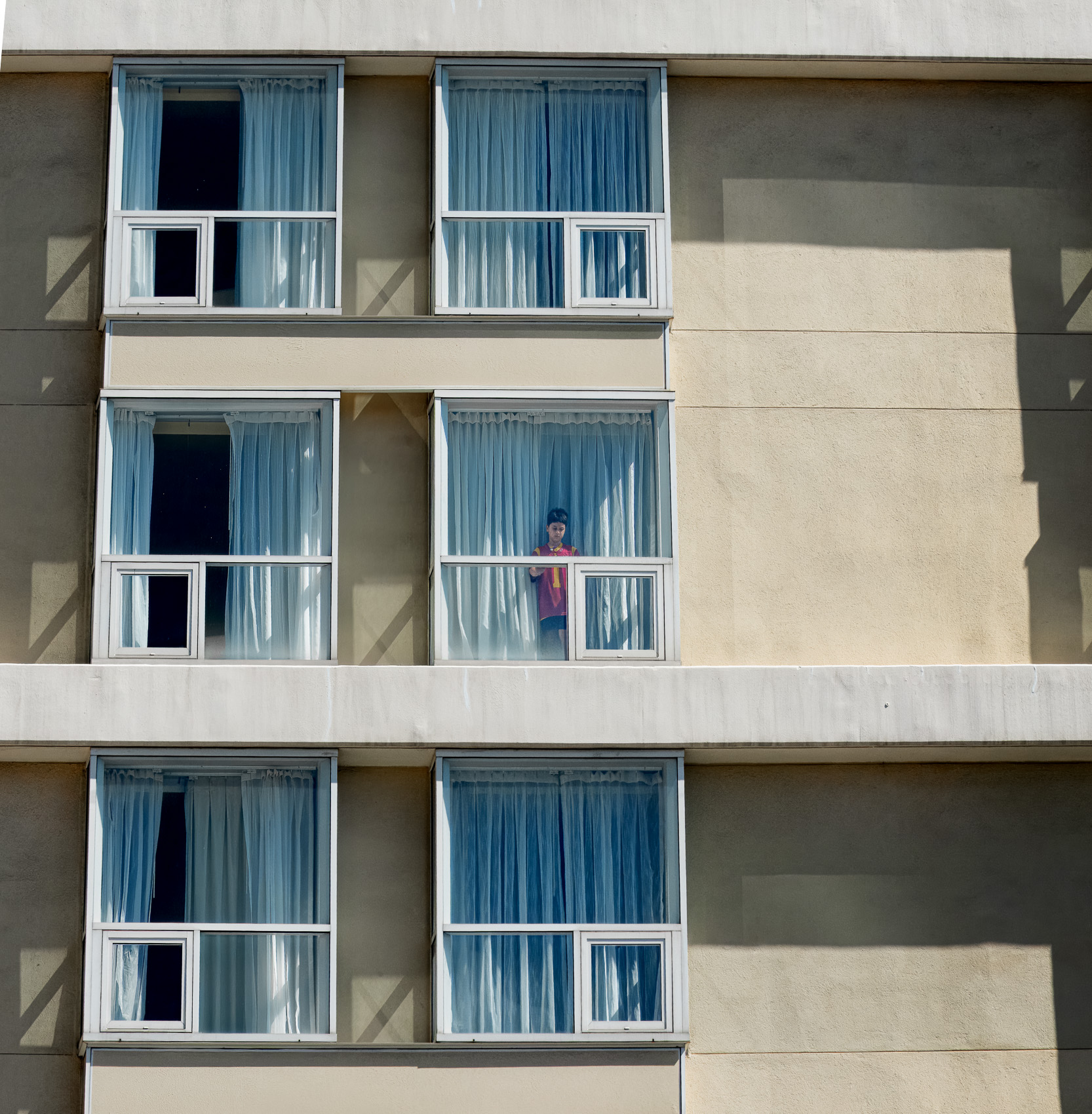
October 2026 - The Boy in Apartment #5
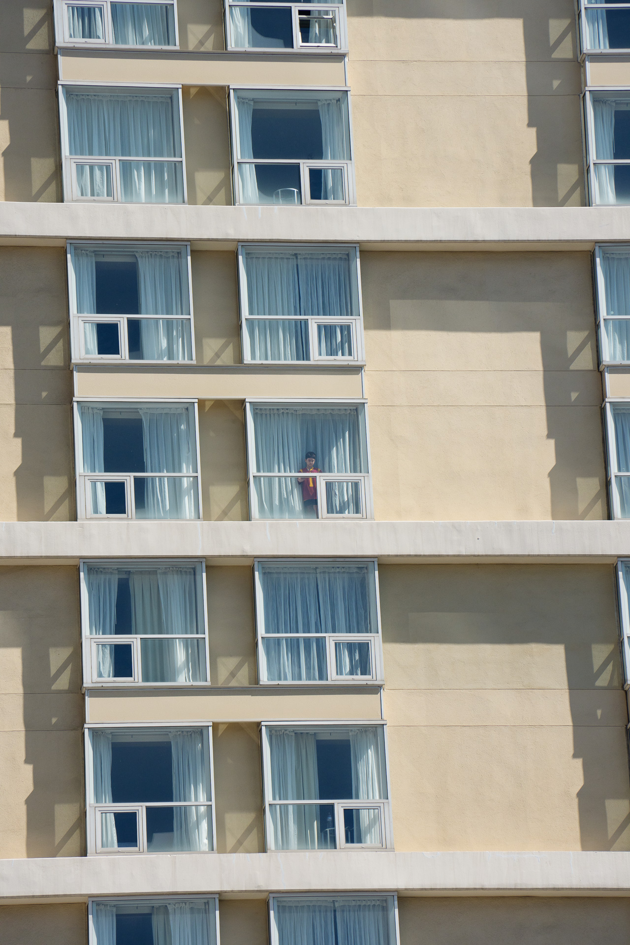
Original
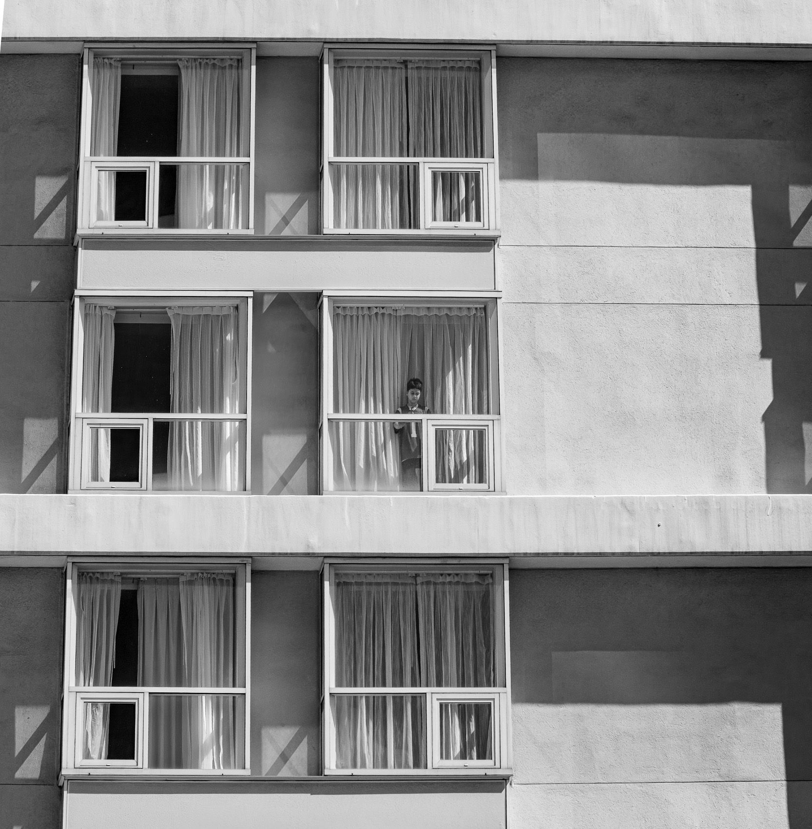
Original 2
About the Image(s)
Visiting Los Angeles last week, I looked up and saw something that caught my eye in an otherwise uniform series of apartment windows. It was a young boy looking out the window and of course on his mobile device. I took several shots until he disappeared behind the curtain. For me, it was the broken symmetry of the scene that made for an interesting photo. I created a B&W version as well (attached) but liked the contrasting colors of the yellowish building, blue curtains, and the maroon jersey.
Sony A1; Tamron 28-200 mm; f /9.0 1/6000 sec. Edited in LR to try and straighten the angles and to highlight the boy in the window.
Original attached.
7 comments posted
Bruce, I think you did an outstanding job isolating a fascinating subject. Straightening the image was a great decision, and the combination of yellow and blue tones creates strong visual appeal. Your crop is good, including just enough of the windows to establish an off-center balance without overwhelming the scene. Have you tried cropping with the same negative space on both left & right of the windows? I'm curious to hear about your thought process on the cropping. The red/maroon shirt worn by the young boy immediately draws the viewer's eye into the photograph, and there are very few competing elements to distract from the story. Overall, this is a beautifully composed image and a unique capture that was executed exceptionally well. Nicely done. Posted: 10/13/2026 23:20:13
Thank you Kerry - I liked the photo but now appreciate as well the greater symmetry that Michele created. Best. B Posted: 10/20/2026 21:32:55
Bruce,
This is an interesting image, but I feel that the subject gets somewhat lost within the frame. The repetitive pattern of the windows is an important part of the composition, but the perspective distortion is a bit distracting to my eye.
I took the liberty of straightening the image and applying a crop. With those adjustments, the subject becomes much more prominent, and the excess empty space on the right is reduced. At the same time, the contrast between the yellow building and the windows remains strong, and the interesting shadows on the left are still preserved.
Just my thoughts, but I think these changes help the image communicate more effectively.
Best wishes,
Michele Posted: 10/14/2026 13:09:47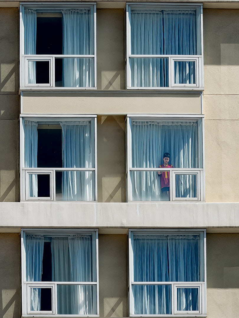
This is an interesting image, but I feel that the subject gets somewhat lost within the frame. The repetitive pattern of the windows is an important part of the composition, but the perspective distortion is a bit distracting to my eye.
I took the liberty of straightening the image and applying a crop. With those adjustments, the subject becomes much more prominent, and the excess empty space on the right is reduced. At the same time, the contrast between the yellow building and the windows remains strong, and the interesting shadows on the left are still preserved.
Just my thoughts, but I think these changes help the image communicate more effectively.
Best wishes,
Michele Posted: 10/14/2026 13:09:47
Michele -
Thank you! I really like your additional PP. I struggled with it myself but will go back and give it another go to see if I can match what you did.
B Posted: 10/20/2026 21:25:15
Thank you! I really like your additional PP. I struggled with it myself but will go back and give it another go to see if I can match what you did.
B Posted: 10/20/2026 21:25:15
Bruce, I preffer the color version and for sure Michele's PP. I would add that the fact that the drapes are closed in one side and open in the other brakes the monotony of the symmetry, and in color the kid stands out better. Posted: 10/17/2026 21:47:11
Isaac - Agree that the color provides more contrast and interest and that Michele's PP will be my next step if I use this image elsewhere. Thanks. B Posted: 10/20/2026 21:26:33
Bruce, this is a striking study in urban geometry, color contrast, and human curiosity. The interplay between the warm yellow facade and cool blue curtains sets up a fantastic palette, while the boy's maroon shirt immediately draws the viewer's eye. The repeating grid of windows creates a strong rhythmic pattern, and breaking that symmetry with a single human subject makes for classic street storytelling. Trimming the empty wall on the right keeps the architectural lines clean and perfectly centers the visual story. Posted: 10/25/2026 14:53:15