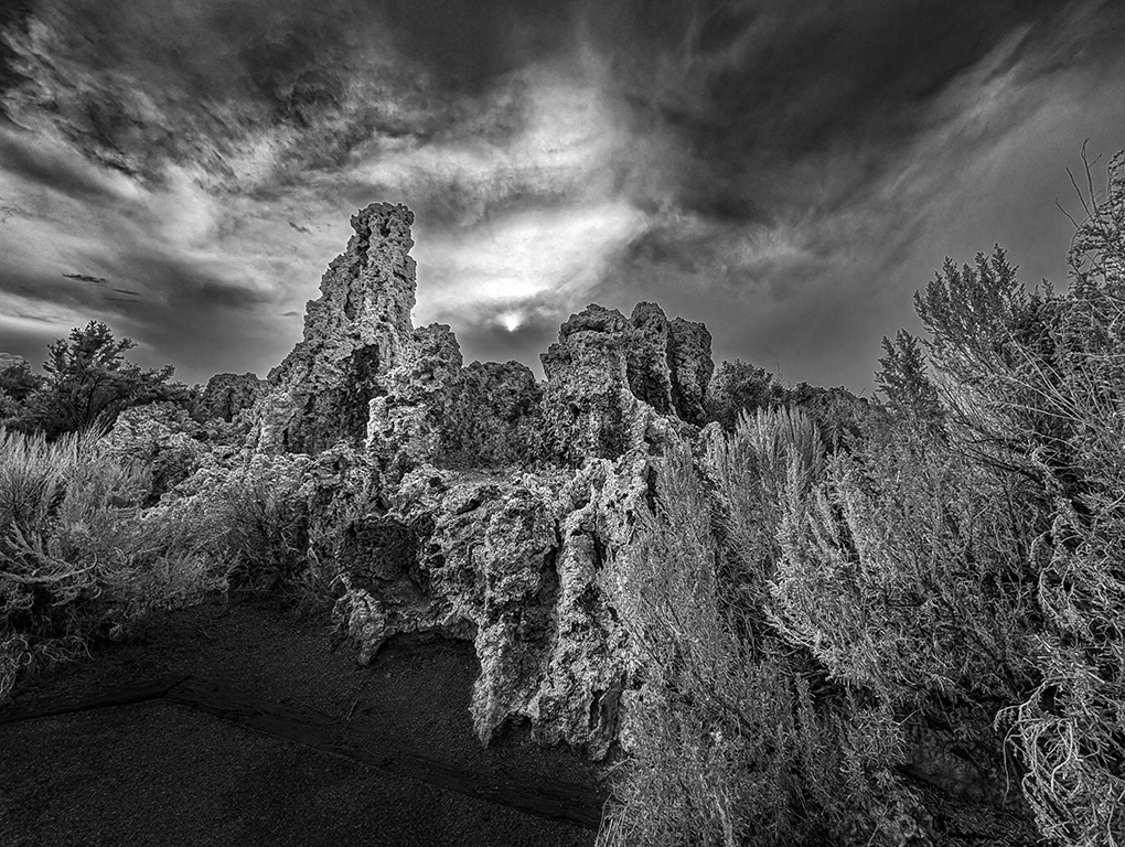
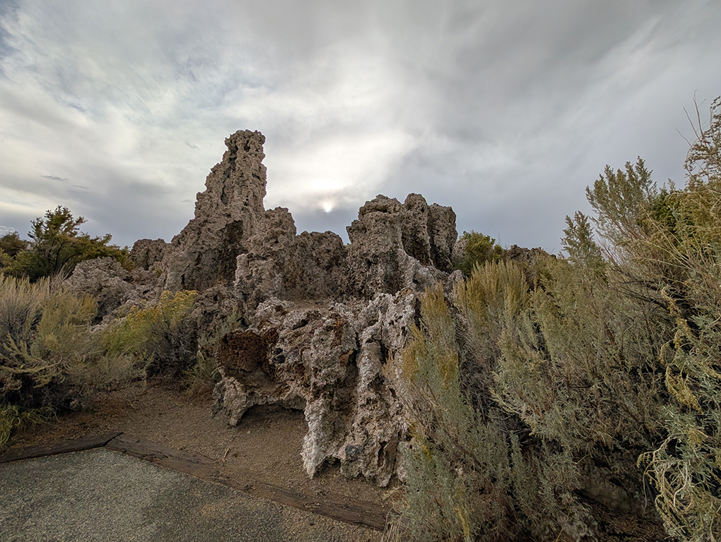
This is a shot that I edited from a very recent trip to Mono Lake, near the north end of the Owens Valley in California, between the Sierra Nevadas and the White Mountains (and other small chains on the Nevada/California border.
Mono Lake, like the Great Salt Lake, has no outflow, and is only fed by relatively small creeks, streams and springs. So, the salinity is quite high, and the pH is alkaline. The lake is about 750,000 years old. Over the years, tufa (large calcium carbonate formations) have sprung up from the result of small springs and volcanic action, forming these interesting towers. Originally, they were below the surface. But, and the water level has declined (and probably also due to the tectonic uplift of the area), some tufa now jut above the surface.
I took this photo with my Pixel Pro cell phone camera, as the sun was starting to settle behind the Sierra Nevadas in the west. It was a cloudy day, so the sun was kind of shrouded, but the cloud cover reflected enough light to avoid very harsh shadows that would normally have existed, making this look almost like a long exposure night shot, or even a light-painted scene. Since color was not particularly the point, and was very muted, I converted the scene to monochrome, using Lightroom's filter set (the #8 B&W filter). Of course, I also used Lightroom to enhance the contrast, highlights and shadows, and darkened the bottom foreground.
9 comments posted
Cindy Lynch
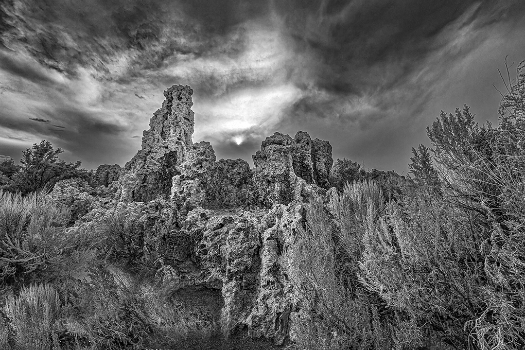
This is a great landscape shot with a dramatic sky which works so well as a monochrome image. The textures of the rocks are represented well in black and white. You have a nice range of tones from pure white to pure black. For me, the lower left corner is distracting because it is so black without much detail. I see there is detail in the original color version. I used the shadow slider in Camera Raw and, for me, it made a difference. I also cropped up from the bottom (8" X 12"). See what you think. Posted: 10/07/2026 13:32:34
Paul Halphen
Thanks, Cindy,
I did not want the parking space effect, so I darkened that foreground, perhaps more than it needed. I like the crop, as it reduces that space, but does not change the impact of the tufa formations. With the crop, maybe I can adjust the darkened space somewhere between where you adjusted to, and where I put it in the initial edit. Posted: 10/07/2026 21:53:05
Cindy Lynch
What if you cloned some of the brush from the right? Posted: 10/08/2026 01:04:35
Paul Halphen
Good idea. I will give it a try. Posted: 10/08/2026 01:18:09
David Terao
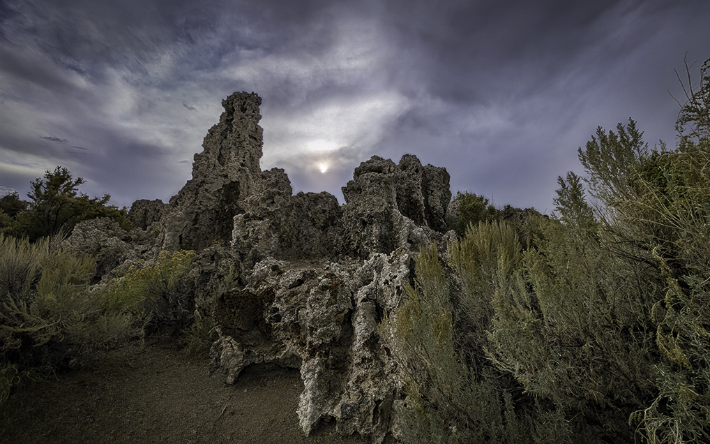
This is a stunning image! Lots of detail and a dramatic sky. I actually prefer your original color image because I like how the subdued colors don't compete with the landscape details and add a sense of depth. I played around with your original image and used Photoshop's remove tool to eliminate the parking lot and make that section blend in with the dirt. I darkened the sky and eliminated the halos around the tufas and trees. I also cropped the image to 16x10 aspect ratio and brightened the sun a bit. Posted: 10/08/2026 21:27:14
Cindy Lynch
I like this version a lot. Posted: 10/11/2026 17:46:15
Paul Halphen
Thanks, David,
I have not had time to work on the color version yet. Our local club has a monochrome sunrise/sunset challenge this month, and this looked like easy pickings to do an effective monochrome conversion. So, I did that first. Haven't gotten back to the trip pictures since then! Posted: 10/11/2026 18:41:21
Beck Poole
I love black and white at first it give the illusion of coral under the water with the waves above. The different textures of the rock, plant and clouds give a good balance and allow the eye to easily scan the image before focusing on the detail. I really like this. Posted: 10/22/2026 10:09:54
Robert Knight
I enjoy both pictures, particularly the sky. I can see why you darkened the bottom left to partially hide the car park and I can appreciate Cindy's interpretation but I find that Cindy's version is rather cluttered and maybe a halfway approach would be to include a bit of the car park because it adds depth to the image. That is what David has done in the colour version so a conversion to B&W from his version would fit the bill for me. The sky in your B&W version is great with strong emphasis between the peaks which draws the eye straight into the image. Posted: 10/27/2026 22:17:05