Kirsti Näntö-Salonen  


Development by Kirsti Näntö-Salonen
October 2026 - Development
October 2026 - Kirsti Näntö-Salonen

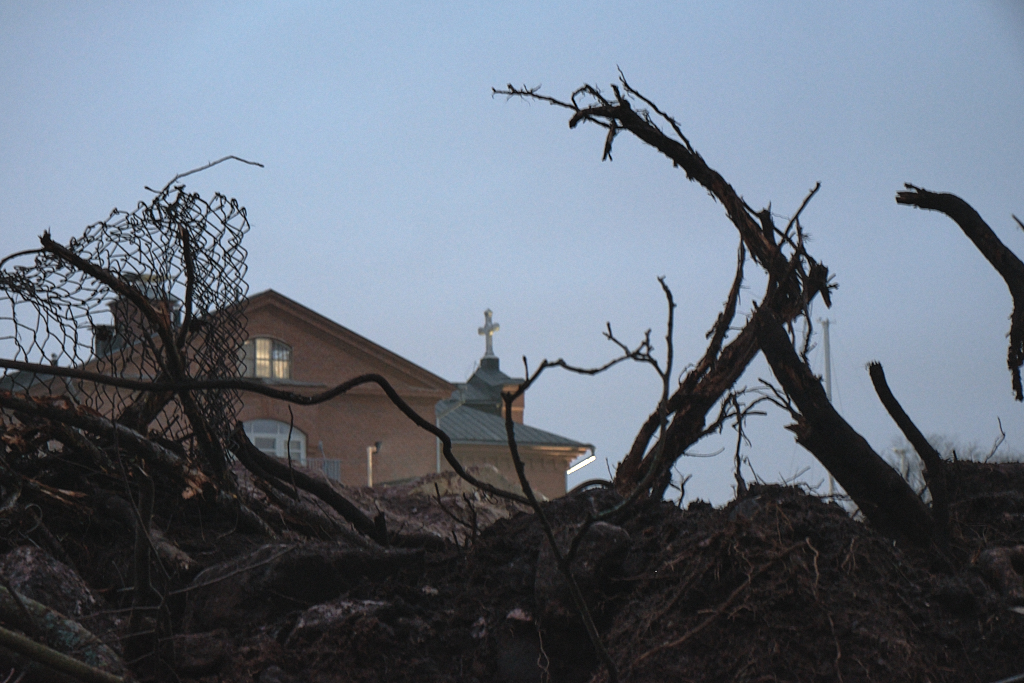
Original

About the Image(s)

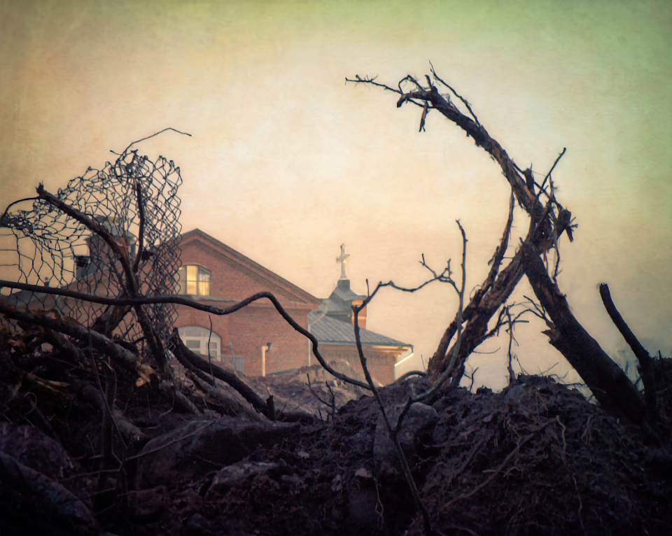
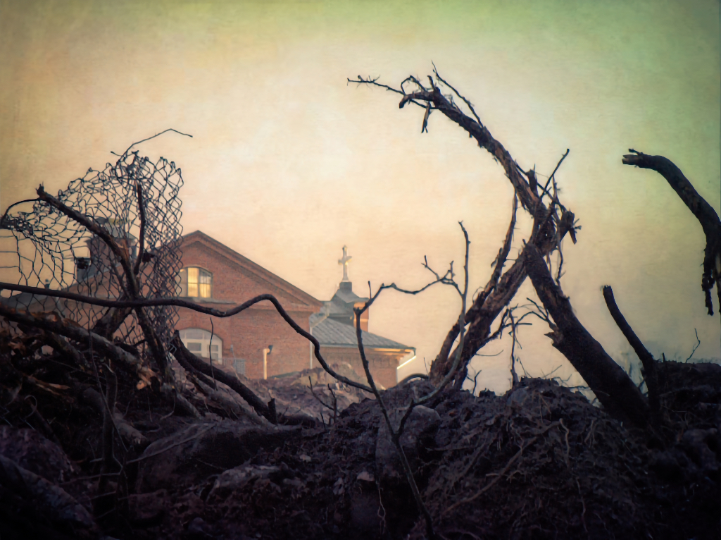
”Development” is an old image I dug up for my camera club?s exhibition about our changing city. The image is from the roughest phase of turning a 19th century historic ex-prison complex on the most coveted building site of the city into luxury housing. They tore down the old walls to build new ones, and the former church in the image is nowadays a hotel, but I guess that this was the only way to save at least something of the history. - Fuji XT-2, 55 mm, ISO 1600, f/10, 1/1.9 s, camera on tripod. The image turned out a little soft and the focus was a little off, but it was my only frame and I felt that it did capture the process of change. I wanted to bring in an element of nostalgy and added a Topaz Studio texture. I finished with NIK Sharpening Output with a depth mask for the foreground that I think helped to sharpen the torn-up roots? What do you think?


8 comments posted


Bob Benson   Bob Benson
I really like the addition of the texture screen to give it a different feel. I think I would like to see the green on the right side adjusted to match more of the yellow/tan on the left.
A word of caution; PSA considers jpeg texture screens provided by software to be someone else's artwork, just like using someone else's sky in your picture. The screen reminds me of the results you can get with a jpeg of parchment paper with contrast and coloring, so if you ever wanted to use it for PSA competitions, you could substitute that. (Most of the softwares allow you to add your own screen to the software package.)   Posted: 10/08/2026 14:10:44
Kirsti Näntö-Salonen   Kirsti Näntö-Salonen
Thank you very much, Bob! The originality issue is an excellent point. We have the same rule in our local competitions. - A while ago, I started a collection of texture images like rough concrete surfaces, and even tried to construct home-made brushes, but have been lazy to add to it. I'll dig up watercolors and parchment now, thank you for the tip!   Posted: 10/10/2026 05:42:32


George Tyler   George Tyler
I like your changes, Kirsti. The color and texture add to the picture. It almost looks like a cemetery or a Stephen King movie set. The twig on the right is a little distracting. Maybe crop it out and a little off the top. Maybe darken the top edge and both top corners.   Posted: 10/11/2026 20:58:36
Comment Image
Kirsti Näntö-Salonen   Kirsti Näntö-Salonen
Thank you, George! I love the Stephen King comparison, that is exactly how it felt! I'll try the crop. - The twig I cropped out several times and always put it back- I felt that taking it off broke the frame.   Posted: 10/11/2026 21:36:11
George Tyler   George Tyler
To keep the eye in the frame, darken that right side and the twig that is there will create the frame.   Posted: 10/12/2026 05:07:52
Kirsti Näntö-Salonen   Kirsti Näntö-Salonen
Thanks, George! A great idea, I´ll definetely do that!   Posted: 10/12/2026 15:11:46


Jose Cartas   Jose Cartas
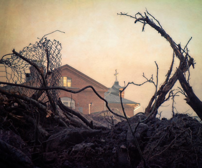
It is a scary image, which I imagine is the feeling you wanted to convey. The texture works well here, although I would tone down the greens a little bit. I like the curved branch framing the church. But I find the outer branch distracting. I would clone it out or, as George suggested, crop from the right to get rid of it and bring the curved branch closer to the picture's border.   Posted: 10/14/2026 01:55:10
Kirsti Näntö-Salonen   Kirsti Näntö-Salonen
Thank you, Jose! Here is a combination of cloning it off and cropping the image a little. I feel, however, that what I gain in eliminating the distraction I lose in balance. I guess that the best solution would have been to take half-a-step to the right when I shot the image!   Posted: 10/14/2026 08:58:16
Comment Image


Please log in to post a comment