Suzanne Wacker
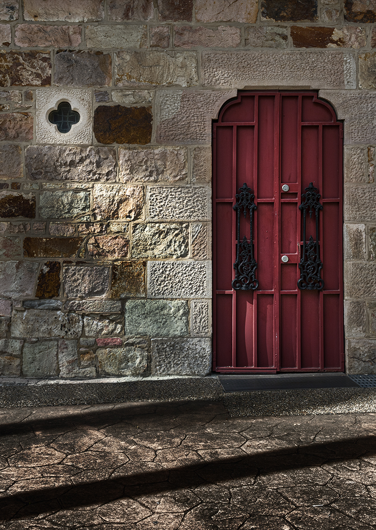
October 2026 - St Stephens Cathedral
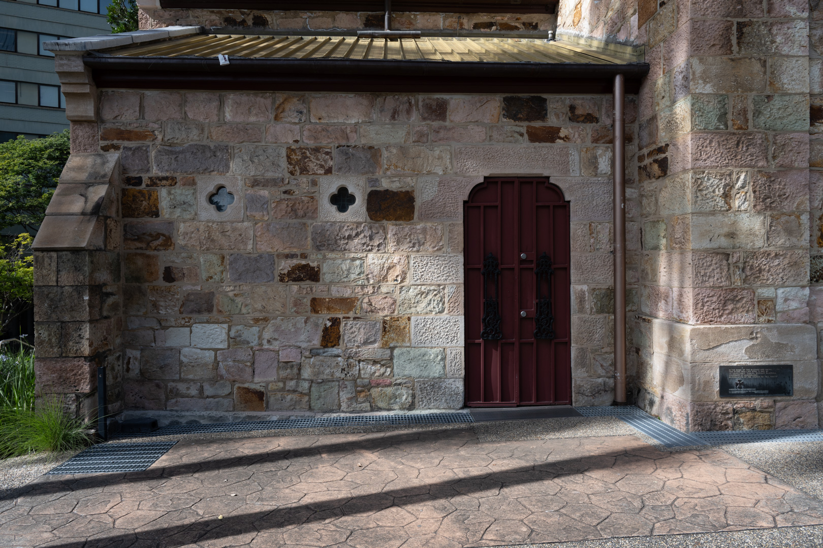
Original
About the Image(s)
I was drawn to the colour and textures, as well as the shadows. I increased clarity and saturation, while also deepening the shadows. I'd love to know everyone's thoughts on whether I can improve it further.
Nikon Z7II, Nikkor Z 24-120mm f/fS, f/10.0, 1/160, ISO125, 26.0mm
10 comments posted
Hi Suzanne, I like what you saw in this image. The light is coming in at an angle creating an enhanced texture in the stonework and the color of the door creates some interesting color contrast. Noted you have removed the metal grating which helps take us back in time. You have gone for increased contrast in the foreground and the diagonal shadow is now very black. Actually I thought there were two steps initially. I would question the need for that so maybe just crop off the bottom shadow. Posted: 10/01/2026 04:32:00
Thanks, Mark. I played around with it but I really like the 2 shadows! I'll keep them for now. I did lighten them slightly as per Sophia's feedback. I think that helped. Posted: 10/11/2026 06:10:16
Suzanne, I think the tighter crop works very well and really brings attention to the red door, beautiful stone textures, light, and shadows. I would not increase the clarity or saturation any further. I might slightly open the deepest shadows to retain a little more detail.
Overall, you did a very nice job recognizing the photograph within the larger scene. The crop transformed a busy architectural view into a much more intentional image about light, texture, color, and shadow. Posted: 10/02/2026 00:58:23
Overall, you did a very nice job recognizing the photograph within the larger scene. The crop transformed a busy architectural view into a much more intentional image about light, texture, color, and shadow. Posted: 10/02/2026 00:58:23
Thanks, Sophia. I played around with the shadows. Posted: 10/11/2026 06:10:31
Suzanne, your processing turned this photograph into a work of art. I love how you brought out the door's color and handled the lighting. I couldn't resist taking your "streak of light" even further. While I was at it, I cropped the bottom, removing the dark shadow. Your thoughts?
Posted: 10/13/2026 15:46:24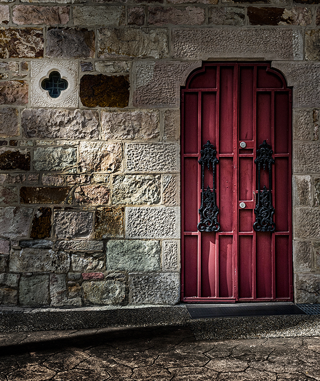
Posted: 10/13/2026 15:46:24
Thanks, Pete. I like what you did with the light. I've decided to keep both shadows. I like them. But I did bring them out a little as maybe they were a little too dark. Thanks again! Posted: 10/13/2026 20:57:28
Hi Suzanne,
very beautiful photograph and good post-processing. I would probably also remove the shadows at the bottom. But if you like them, then the shadows should stay :-) Posted: 10/19/2026 13:51:56
very beautiful photograph and good post-processing. I would probably also remove the shadows at the bottom. But if you like them, then the shadows should stay :-) Posted: 10/19/2026 13:51:56
Thanks, Natalia! Posted: 10/24/2026 02:17:44
Hi Suzanne. I really like the contrast between the rich red door and the varied textures and colors of the stone wall. The architectural details and the small window add interest, while the sunlight brings out the texture of the masonry and creates an appealing interplay of light and shadow. I wondered about a slightly tighter crop from the bottom myself. I'd also consider lifting the shadows on the door slightly to reveal more detail in the ironwork. Posted: 10/23/2026 17:37:35
Thank you, Anna! Posted: 10/24/2026 02:17:55