Anna Proczek
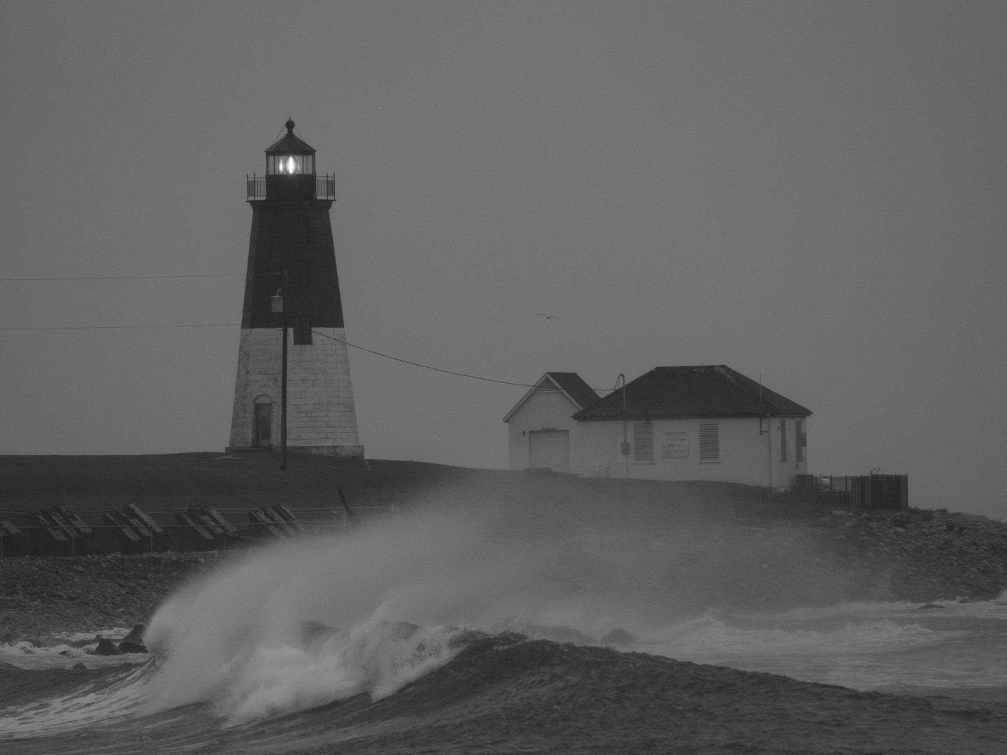
October 2026 - Nor'Eastern
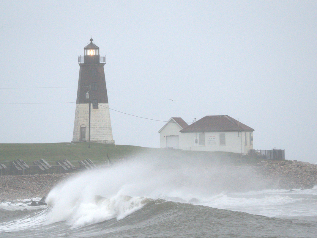
Original
About the Image(s)
This photo was captured during the storm last weekend. I didn’t make any edits to it, but converted it into B&W. I like it the way it is because of the atmosphere surrounding the lighthouse. I might come back to it after some time and edit it then, ISO 800, 210mm, f/6, 1/2000sec.
9 comments posted
Hi Anna, this is a fantastic stormy scene and well worth the effort to brave the elements and capture it! I haven't come to terms with the processing which has reduced the tonal range a lot. It does create a menacing vibe which goes with the subject but then I struggle with the flat nature of the image. I wonder if there are any details to be extracted from the sky? Maybe select sky and see what dehaze does Posted: 10/01/2026 04:49:36
Hi Mark. Thank you. I tried the dehaze and didn't like it. Yes. I agree that the tones are flat. Posted: 10/13/2026 19:19:11
Anna, like Mark, I find it a fascinating scene that gives the feeling of the storm. I understand why you haven't edited it yet. It definitely captures the storm's atmosphere. I took the liberty of playing with it a bit... and then took the liberty of turning it into a different image. Here is the result. I hope you find it interesting. Posted: 10/02/2026 01:05:03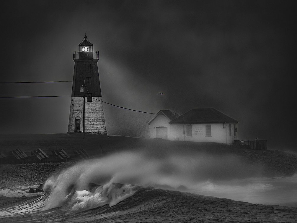
I don't know what happened, but my first attempt to post this image wasn't what I intended. Hopefully, this one is more interesting.
Posted: 10/02/2026 01:06:24
Posted: 10/02/2026 01:06:24
Hi Pete. Thank you. I like your version too. It has much darker mood. Posted: 10/13/2026 19:20:37
Anna, I really like what you did with this version. You added enough contrast and depth while still preserving the wonderful stormy atmosphere. Pete's version is certainly more dramatic and shows how differently the image can be interpreted, but I like the mood you maintained in yours. If possible, I would also remove the power lines, as my eye keeps going to them. The glowing lighthouse and crashing wave are strong enough to carry the image beautifully. Posted: 10/02/2026 01:13:21
Hi Sophia. Thank you. I agree with removal of the powerlines. Posted: 10/13/2026 19:21:58
Hi Anna. I like the mood in this image and the glowing light really makes it. I feel it's just a little too gray and flat. I think you could add just a touch more contrast and brighten up the whites slightly, while still retaining the mood you were going for. I like the way the crashing wave creates a line that leads us to the lighthouse. Posted: 10/12/2026 05:38:32
Thank you Suzanne. I will try to do that. Posted: 10/13/2026 19:22:59